Three Escape Rooms, One Clear Path To Booking.
How we rebuilt The Lockup’s website around its three escape rooms, with clear prices, answers for groups and parties, and booking without leaving the site.
The Business
The Lockup runs escape rooms on London Road in Sheffield. Groups of 2 to 8 players get locked in, then work together to solve puzzles and get out against the clock. There are three rooms: Meltdown, set in a nuclear power plant; Deep Space Brig, a sci-fi horror; and Mutiny, a pirate escape where every player starts in handcuffs.
The customers are as mixed as the rooms: couples, colleagues, parents and kids, students and big groups. The Lockup is pet friendly, wheelchair accessible, and offers 10% off for students, carers, the armed forces and Blue Light card holders.
The Challenge
An escape room is an impulse booking. Someone suggests it, a group chat lights up, and whoever is organising needs to answer the same questions quickly: which room, how much for our group, is it too scary, where do we park, and when can we go?
The Lockup’s old homepage tried to answer all of that on one long page. The version archived in May 2024 put the rooms, prices, kids policy, dogs, accessibility, behaviour rules, a long FAQ and a contact form one after another. Further down, a blog section showed four “Test Blog” posts filled with placeholder Latin text, and the reviews section showed placeholder quotes credited to “John Smith” instead of real customers.
What We Did
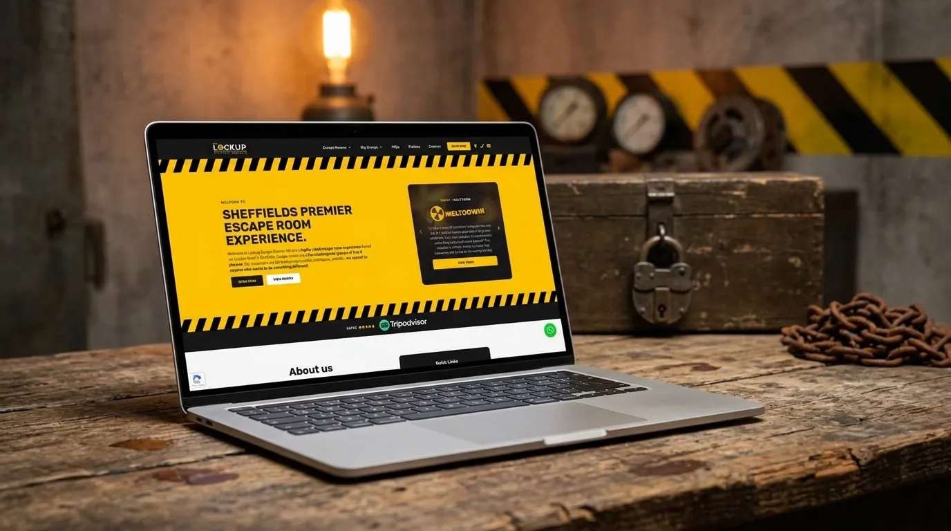
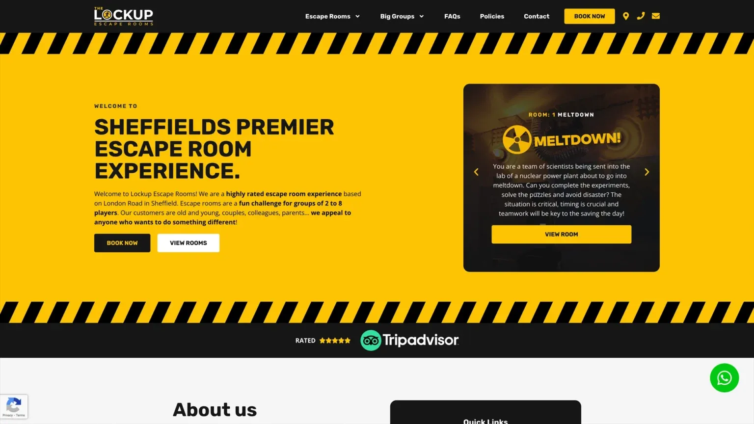
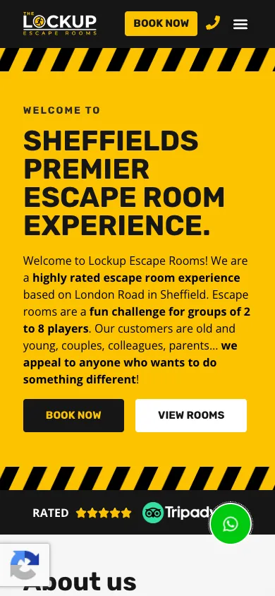
We designed and built a new website with a bold yellow and black look, with hazard stripes that suit a business built on locked doors.
The homepage now leads with what a group needs to decide: the three rooms, each with its theme, player numbers, difficulty and scare factor. A price table shows the cost per person and the total for every group size, so the organiser can quote the group chat without a calculator.
Instead of one long page, the detail moved to where people look for it. Each room has its own page. Kids parties, big groups and corporate bookings each have a page that answers their particular questions, and the FAQs and policies live on their own pages too.
Booking stays on The Lockup’s own website, with the booking calendar built into the page. Book Now buttons sit in the header and under every room, and on a phone there’s a WhatsApp button for quick questions.
What Changed
Visitors now see the rooms first, then the prices, then a Book Now button, in that order, on any screen. The placeholder blog posts and “John Smith” reviews are gone. In their place is real proof: a Tripadvisor rating straight under the headline, and their Google review count further down the homepage.
Groups with particular needs, from a kids party to a team day, now have a page written for them rather than a paragraph on a long homepage.
Built Around How Their Customers Decide.
- 01
Choose Your Room At A Glance
Each room shows its theme, how many players it takes, its difficulty and how scary it is, so a group can pick the right one in seconds. Deep Space Brig even has a scare-free mode.
- 02
Prices With No Maths
A simple table shows the price per person and the total for every group size from 2 to 8, with the student and Blue Light discount codes right beside it.
- 03
Book Without Leaving The Site
The booking calendar sits on The Lockup’s own website, so customers pick a room and a time and pay without being sent somewhere else.
- 04
Answers For Every Kind Of Group
Kids parties, big groups and corporate team days each have their own page, and the FAQs cover parking, access and what to expect before anyone has to ask.
Other Businesses We’ve Helped.
Want Results Like The Lockup’s?
No hard sell. We’ll look at what you have now, tell you honestly what we’d change, and give you a clear price.