Key Takeaways:
- Responsive design ensures your website looks great on all devices, enhancing user experience and engagement.
- It significantly improves your site’s SEO, making it easier for customers to find you online.
- Responsive websites adapt to future tech changes, ensuring your site remains accessible and functional.
In today’s digital age, where the line between online and offline shopping blurs, the importance of responsive design for small businesses cannot be overstated. The Marketin’ Guys, led by the dynamic duo of Dan and Jordan, champions the cause of leveraging responsive web design to catapult small and new businesses into the digital forefront. This isn’t just about having a website; it’s about ensuring your digital presence flexes with the needs and behaviours of your audience, irrespective of the device they use. Let’s dive into the gritty, no-bullshit details of why responsive design isn’t just important but essential for your business growth.
The Essence of Responsive Design
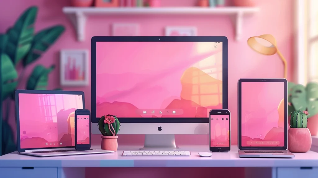
At its core, a responsive design means your website’s layout and content adapt fluidly to the screen size it’s being viewed on. This adaptability eliminates the need for a different design and development phase for each new gadget on the market, ensuring your site is accessible and functional across a myriad of devices, in the realm of The Marketing Guys, where honesty and straight talk form the cornerstone of our ethos, we cannot stress enough how crucial this is for small businesses looking to make a mark online.
Enhanced User Experience and Engagement
First impressions matter. A website that adjusts seamlessly across devices ensures a positive first impression. It’s about presenting your brand’s story in the best light, irrespective of whether it’s viewed on a tiny smartphone screen or a large desktop monitor. Responsive design eliminates unnecessary scrolling, zooming, and resizing that can frustrate users and drive them away. Instead, it offers a smooth, engaging experience that keeps users on your site longer, increasing the chances of conversion.
Boosted SEO Rankings
Google loves responsive websites, and in the world of digital marketing, what Google loves is gold. Responsive design is an SEO powerhouse, helping improve your site’s rankings on search engines. Google has explicitly mentioned that responsive design is a significant ranking factor because it enhances the user experience. Responsive sites are easier to crawl and index, which translates to higher visibility for your business. In the fiercely competitive online market, being visible means being relevant.
Future-Proofing Your Website
The digital landscape is ever-evolving, with new devices and technologies emerging at a breakneck pace. A responsive website is essentially future-proof. Regardless of what new screen sizes hit the market in the coming years, a responsive site will adapt and continue to display your content in the best possible way. This adaptability saves you time and money in the long run, as you won’t need to redesign your website with every new device that becomes popular.
The Bottom Line
In a nutshell, responsive design is not just a fancy buzzword but a fundamental element of modern web development and design. It embodies the no-bullshit approach of The Marketing Guys to delivering top-quality, affordable digital solutions to small and new businesses. By embracing responsive design, you’re not just optimizing your website for today’s devices but also ensuring it remains effective and accessible no matter what the future holds. Remember, in the digital world, adaptability isn’t just an advantage; it’s a necessity.
Navigating the Technical Terrain of Responsive Design
Venturing deeper into the digital domain, let’s unravel the technical wizardry behind responsive design. This section is for those who want to grasp the nuts and bolts that make websites look fabulous on any device. Brace yourself for a ride into the world of media queries, flexible grids, and images, garnished with our trademark no-bullshit insights.
Media Queries: The Magic Behind Flexibility
Media queries are the cornerstone of responsive design, allowing web content to adapt to different conditions such as screen resolution, device orientation, and platform. Think of them as the digital chameleons, enabling your website to seamlessly adjust its appearance based on the user’s device. For small businesses, this means delivering your message effectively, whether your audience is on a laptop, tablet, or smartphone.
Flexible Grids: Fluidity in Structure
At the heart of responsive design lies the concept of fluid grid systems. These grids use relative units like percentages, rather than fixed units like pixels, to define web page elements. This flexibility ensures that your site’s layout stretches or shrinks to fit the screen it’s viewed on. Imagine a rubber band expanding and contracting without losing its shape; that’s your website on a flexible grid, maintaining coherence and usability across devices.
Responsive Images: A Picture-Perfect Approach
Responsive images are crucial for ensuring that your visuals look crisp on every screen, contributing to faster page load times and improved user experience. Techniques such as the srcset attribute in HTML allow you to specify multiple image files for different screen resolutions, ensuring that the browser selects the most appropriate one. This not only enhances the visual appeal of your site but also optimizes performance, a key factor in retaining users and improving SEO rankings.
Real-World Examples and Actionable Tips
Let’s consider a few examples of responsive design done right to bring these concepts to life. Websites that exemplify this approach often feature a harmonious blend of flexible grids, media queries, and responsive images, providing a seamless experience regardless of the device used.
- Prioritize Content Hierarchy: Make sure your most important information is visible and accessible, regardless of screen size. This might mean simplifying your site’s design or reorganizing elements to fit smaller screens.
- Optimize Images: Use tools and techniques to ensure images load quickly and look good on all devices. This improves both user experience and SEO.
- Test Relentlessly: Utilize device emulation tools to test your website across a range of screen sizes and resolutions. This helps identify and fix issues before they impact your users.
The Takeaway
Responsive design is more than a trend; it’s a fundamental approach to web development that reflects the evolving landscape of internet usage. By embracing these technical elements, small businesses can ensure their websites are not just functional but also future-proof. It’s about creating digital experiences that are as adaptable and dynamic as the market itself.
In conclusion, responsive design isn’t just about making things look pretty; it’s about enhancing functionality, improving SEO, and ensuring your website stands the test of time and technology. For small businesses aiming to thrive in the digital arena, adopting a responsive design is not just a good idea—it’s a necessity.
By incorporating these technical insights and practical tips into your website strategy, you’re not just building a website. You’re creating a digital ecosystem that grows with your business, ensuring your online presence is as resilient and dynamic as your ambition. Welcome to the future of web design, where flexibility, functionality, and forward-thinking are the keys to success.